July 30th, 2007
Kathy Carroll Shoutout
I just spent the weekend in the Chicago area at my friend Kathy Carroll’s studio, The Chicago Institute of Fine Finishes. Kathy was so kind to invite me there to help familiarize me with the Oikos product line and allow me to make samples for our upcoming Italy trip using those products. You see, we’ve decided to use Italian plasters, available in Florence, for our projects there and Oikos is one of the largest decorative coatings manufacturers there in Italy.
Not only did she provide me with her space and product knowledge, Kathy even blessed me with her two EXTREMELY good assistants Jennifer and Jenna, who were kept busy custom tinting quarts of Travertino, Marmorino and Veltura alla Calce for me to test out techniques and color palettes. They are shipping the samples back to me this week, so I will photo and post them later this week. Meanwhile, here are some photos from Kathy’s studio.
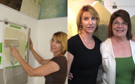
Me playing/working and me and Kathy trying to get a good photo of the both of us before I rushed off to catch a plane. We gave up after 5 tries!
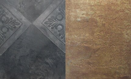
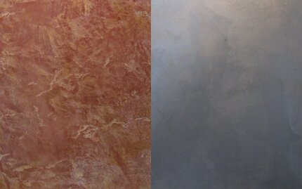
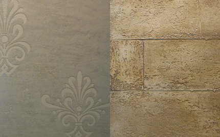
Some of Kathy’s cool Oikos plaster samples I found around her studio. Kathy carries a wide range of products and teaches classes on all of them! www.fauxbykathy.com.
May 9th, 2007
Marquetry Mayhem
I have written previously on the Marquetry Masking Pattern ™ technique I’ve developed using Modellos in the Wood You, Could You post. With my new bedroom maple floor going down tomorrow and the house in complete disarray, Lauren and I have been frantically working on getting the design down so I can have it cut and ready for my “weekend with wood”. I found this design in a book of historical patterns. The source listed is floor tiles from Poland. I am always drawn to the rythm of interlacing circle designs. Once the design is vectored, it’s easy to start playing around with coloration options. Here’s the process.
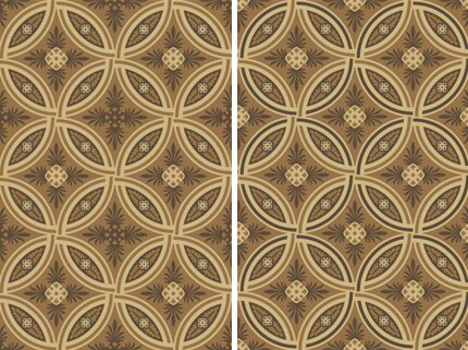
You can see the subtle difference between the left and the right. The additional contrast of the alternating darker rings adds a more interesting dynamic to the design. I thought this was the winner, until….

Bingo! More contrast and variety and I am ready go! Each circle will be 18″ diameter. If it doesn’t look as fabulous as I think it will, well, that’s what they make area rugs for.
May 2nd, 2007
Pattern Appearing
I saw these wonderful back-to-back posts on the style files this past weekend. Anything that looks like stenciled pattern catches my eye especially when it is a unique application!

The first post was about Solid Poetry, a Design Academy project by Susanne Happle and Frederik Molenshot that explores the possibilities of “hidden” designs appearing as the environment changes. Here the pattern in the concrete appears as it becomes wet. I can just imagine a shower where vines grow up the wall as the water and steam rises.

The other one, Stenciling Your Garden would be easier for most of us to achieve: Killing off the grass, but in a decorative pattern by placing templates on the ground for a few days. This would be a great idea for a garden wedding!
April 2nd, 2007
In a Colorful Mood
So, I have started attempting to plan what types of design themes, color, patterns, etc. I will be decorating our new building with. Got my little design notebook going. It’s so cool to have all this design at my fingertips and have the ability to do anything I want! It’s such a burden to be able to to anything I want!! How do you narrow down a choice from “everything” to “something”?
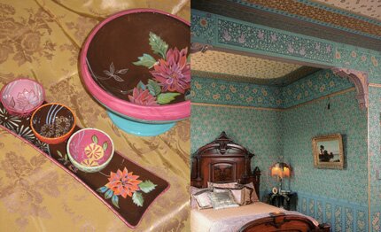
Answer: Find a theme and tease it out. For my office I’ve decided that my theme will be decidedly color decadent and follow the Aesthetic Design Movement battlecry “Art for art’s sake”. The photo at left shows some Tracy Porter ceramics I just bought on sale at Horchow. Love those colors and I think those little bowls will be perfect for holding paper clips and such! The right photo is from Bradbury and Bradbury. Somehow the Victorian love of combining dramatic colors with layered pattern is looking really fresh to me.
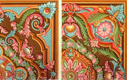
I am designing from the floor up. I have decided to have an unfinished wood floor installed and want to use a combination of new, custom designed Modello masking patterns and stencils to create lush surface of dark chocolate, teal, pink, green and gold. I love the look and feel of these 17th Century designs shown above and below.

Looking at some of the latest furniture from Anthropologie (below) I see that, yet again, those guys are following my lead. LOL. Personally, I think the 17th Century designs have a lot more legs, but I like the idea of being in good company all around.

March 30th, 2007
The walls they are a changin

About 7 or 8 years ago I redid this tiny little bedroom in my home into my home office. It had to be really nice as it was going to be photographed for a book by BHG along with other rooms in the house. See Enriching the Ranch. I’ve loved it immensely but it’s time for a change!
My idea is to make the walls look as if they were created from a patchwork of Japanese Kimonos and I REALLY need to get this done before I completely tire of this theme. I’ve gotten so far as to get the furniture out of the room and have laid out one wall treatment.
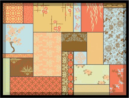
Each “patch” in the room will be totally unique and a little artwork unto itself. I will be using metallic leaf, paints and plasters to give it all a nice soft shimmer. The Lights and Lovely post on the Art of Living blog shows some possible light fixtures to hang from the ceiling I may make look like a shoji screen. I am still debating if I want to put the art directly on the walls or apply it to canvas or paper and wallpaper paste it up there. Either way, it will be quite the little project! I think that I will create a little book to sell detailing how to do the finishes. Stay tuned!




 Copyright © Designamour