March 16th, 2012
Annie Sloan Takes America
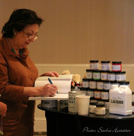
The Annie Sloan North American Tour is ON! I’ve just returned from an exciting week in New Orleans, where Annie has kicked off her North American Tour by presenting an inspiring class to those of us who are privileged to stock and sell her incomparable and original Chalk Paint. In just the last year, the number of Annie Sloan Chalk Paint stockists in the U.S. has grown from a handful to 191 nationwide, and it’s a lovely family of dedicated, inspired, and creative people who are now sharing the beauty and versatility of “The Best Paint in the World” for repainting and repurposing furniture, cabinetry, and decorative accessories with this amazing product.
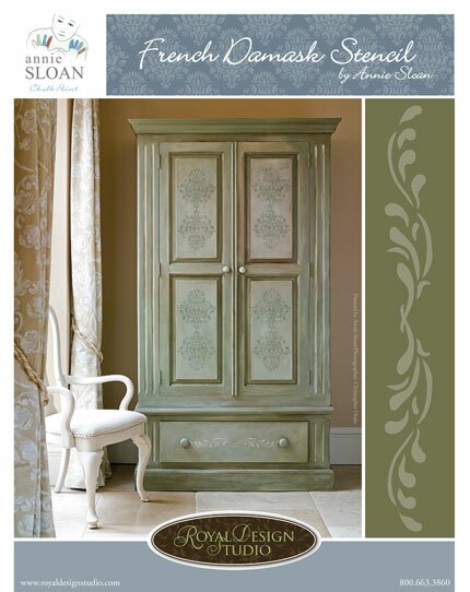
Royal Design Studio is sponsoring the tour with a free French Damask stencil, exclusive to all tour participants, that was designed by Annie herself.
In the Stockist’s workshop Annie shared with us an easy stencil technique that is a wonderful way to add layers of color and the expression of age and time with Chalk Paint.
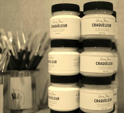
We were also introduced to Craqueleur, a two step clear crackle varnish that is ideal for adding the effects of age to furniture and can be used over stenciling and decoupage work as well.
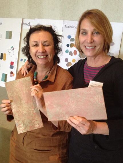
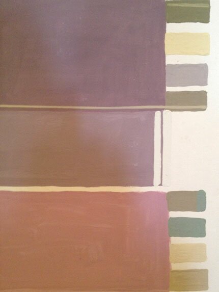
Most inspiring of all was the lecture Annie gave us on color theory using her Chalk Paints. She has prepared a series of boards that she will also share on the tour that shows how easily colors can be combined and neutralized, as well as gorgeous color combinations to represent French, Scandinavian, Boho Vintage, Neutral, and Modern design themes. If you are unable to make it to a class on the tour, Annie also shares color colour advice regularly on her Paint & Colour blog.
In addition to playing with paint, we also got to “just play.” Here is a photo of Lisa Richert getting ready to lead the 2nd line dance at the fabulous party that they threw for us in one of the beautiful mansions of the New Orleans Garden District. Lisa also leads Annie Sloan in North America (and soon in Australia, mate!) as Annie Sloan Unfolded. What has impressed me the most (and always has) is Lisa’s passion for this paint, her commitment to Annie Sloan both as a person and a brand, and the complete professionalism and dedication of her whole inspiring team.
Annie herself is a true “original”, a consummate and accomplished artist without ego-full of as much grace and humility as talent and creativity. She leads by example and everything related to Annie Sloan Chalk Paint flows beautifully from her. It’s an honor to be an ambassador for her and her brand.
Is Annie Sloan coming to a city near you? Find out here. The tour has begun but there is still time to register for upcoming workshops in San Francisco, Denver, Chicago, Atlanta, Leesburg, and Boston!
February 12th, 2012
Going for Green
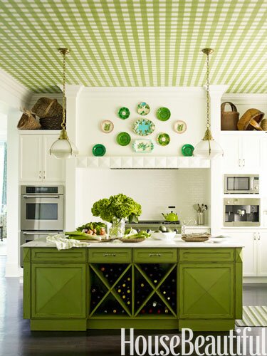
Recently, I was asked by House Beautiful to participate in a blogger’s feature on inspiring green spaces from the pages of House Beautiful magazine. The assignment: Share how a “green” space has inspired you in your designs, work, or blog posts.
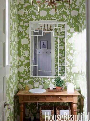
Well, there is SO much to be inspired by in the pages of House Beautiful and on their website, but I chose the image above that I had blogged about before here. I have to say I was VERY flattered to be asked and now even more so that the feature is up and I see the other bloggers that were included. There is quite a nice collection of images and insights from the bloggers who chose them…
Holly Becker, who blogs at the Gr8 blog decor8 picked this powder room with a fresh graphic floral wallpaper. Its amazing how a pattern like this can visually expand a small room, isn’t it?
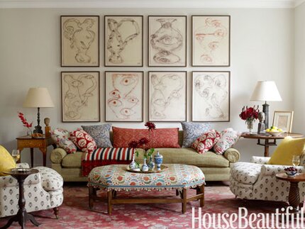
Maria Killam, a color expert and blogger at mariakillam.com, chose this lovely living room that ran on the cover of the October 2010 issue. I can see why! I love the mix of ethnic prints and modern art. Plus, the light in this room amazing….
Matt Armendariz, food photographer and blogger at mattbites.com, chose this gorgeous kitchen with a green gingham ceiling. He says, “If I had my dream come true, it’d be this kitchen, featuring the happiest of bright greens in shades of pea and emerald.”
I too love gingham ceilings. I once worked with avery daring designer who upholstered her very large beamed ceiling with a tiny green gingham. It was amazing! She also had me stencil gingham on cabinets, doorways, and furniture….among other things. You can see some examples here.
Are you craving more green? You can see all 10 House Beautiful “green” pics here.
January 13th, 2012
Pinning! Color Crush
Introducing your newest addiction. Design Seeds is like color lover’s crack. Color pusher Jessica has organized her beautifully created palettes by thoughtful themes including mineral, summer, vintage, edible. Don’t know about you but I could just eat this up all day long! Link to this palette on Design-Seeds.

Source: design-seeds.com via Melanie on Pinterest
September 1st, 2011
Indigo Stencil Inspiration
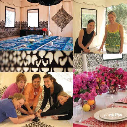
Well, it is just one month away today that my 4th and next Peacock Painting trip begins to lovely Peacock Pavilions in Marrakesh, Morocco. We have a fabulous group going but there is still space and time available if you’d like to join us on October 1-11! You can find more trip and itinerary details here.
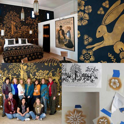
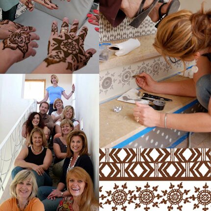
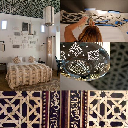
I’ve written about these trips about a million times, so you may know that I coordinate these painting adventures with the super chic and creative Maryam from My Marrakesh. Maryam has no limits to offering up great spaces to decorate with paint, or exotic inspiration to draw from. On past trips we’ve applied all sorts of inspired decoration to varying surfaces throughout Peacock Pavilions-a boutique hotel and retreat site just outside of Marrakesh.
There was an Art Deco Mural inspired by Rateau,
stair risers based on henna patterns,
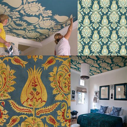
ceiling patterns taken from inlaid camel bone furniture
and antique suzani fabrics. We’ve done lovely lace and typography floors,
and even an entertainment tent stenciled with Fez embroidery inspired patterns.
We have several projects planned for this next trip, the largest which will be another stenciled concrete floor with the look of patterned indigo fabric. The floor will be the base of a new, open air tent created for outdoor yoga practice and more.
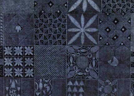
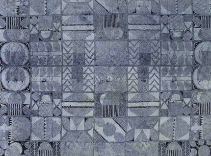
As I begin to work on the designs, I thought I would share some of the inspiration I am working from: Nigerian resist-dyed indigo.
Resist techniques such as tie-dye, folded and stitched resist, wax batik and starch resist are common methods of surface decoration throughout the West African region, and the Yoruba of Nigeria are masters of the indigo-dying process. The two examples above are done with a starch-resist method, where the cloth is carefully folded and the intricate patterns hand drawn using starch made from cassava flour and sharpened quill from a large bird.
Stitched resist patterned are achieved also by folding the fabric, but raffia is used here to stitch the patterns into the cloth. When dipped,these areas resist the indigo dye, which is infused over multiple layers to achieve the rich inky blue/black color. The level of detail and intricate quality of this work is quite humbling for me as I attempt to interpret these into easily usable stencil designs! I am really looking forward to this, though, as I think that the concrete stained and painted floor that we create will be AMAZING!
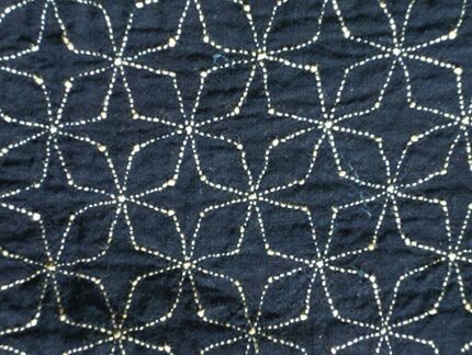
Serendipitously, I just happened to stumble across this post on Indigo on a lovely blog called This is Love Forever, by super stylist Kayte Terry which featured the above fabric sample. One of the previous Peacock Painting trips caused me to design a whole collection of Moroccan stencils based on zelij tile patterns and this is one that we have called Large Moroccan Inlay. I think that doing this pattern in random sized dots would be be brilliant and pondering if this could be replicated on dark denim fabric using a bleach pen?!?! Hmmmm.
Just have to say it one more time guys….if you are interested in going on an amazing journey to Morocco with us, you can find more trip and itinerary details here. ![]()
May 24th, 2011
Pretty in Pink…and Coral
Is there any other flower that inspires more color lust than a rose? That is the question posed in this month’s House Beautiful’s Paint Palette page-one of my favorite parts of the magazine. Last month, we looked at Shades of Sea Glass.
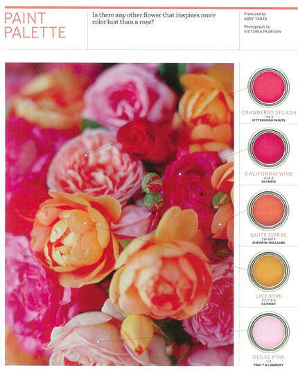
This month’s palette features my favorite floral color combination: hot pink, pale rose, and orange-y coral. I used this color combination as the theme for my wedding flowers last August. Below, they are realized in some inspirational room settings with Royal Design Studio stencils…..
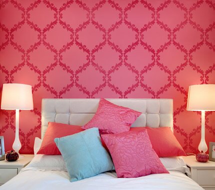
Small Acanthus Trellis wall stencil in hot pink and fuschia.
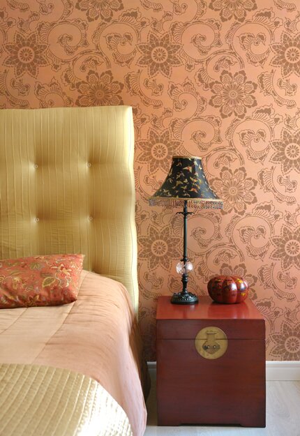
Kimono Allover Japanese wall stencil in a soft, soothing coral.
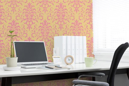
Foliate Damask allover wall stencil in petal pink on golden yellow.
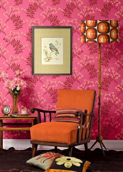
Small Berry Romantic floral wall stencil in hot pink, cranberry, and coral.
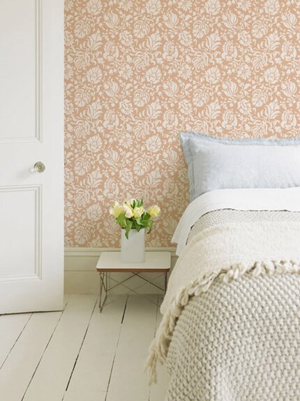
Large Allover Brocade damask wall stencil in cream over a dusty coral base.
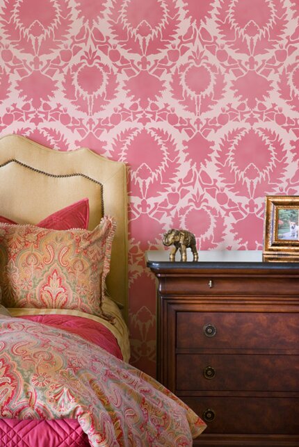
Silk Road Suzani wall stencil in rose over the palest petal pink. Don’t forget to stop and smell the roses today!
April 22nd, 2011
Shades of Sea Glass
Sea glass is the beautiful, natural result of something “not so pretty” OR natural: littering. Glass bottles and jars that are tossed or washed into the sea get broken up and tossed about in the currents. Over time, the sharp edges of the shards of glass get worn down and the surface becomes etched by constant contact with waves, water, and sand.
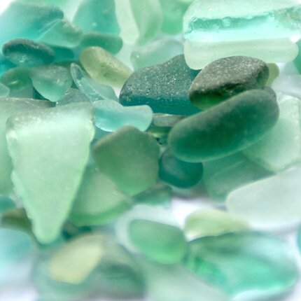
Sea glass can be found in many colors, but some of the most lovely are soft shades of blue/green.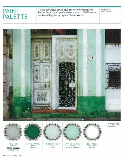
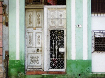
This beautiful photo of a set of doorways in Old Havana, as seen in the current issue of House Beautiful caught my eye. Not only because I LOVE historical architecture, and anything that looks distressed, crusty, rusty, faded, well-used and well-loved. The colors also reminded me of blue/green sea glass, and we have been using these colors quite a bit in our inspirational stencil pattern photos….
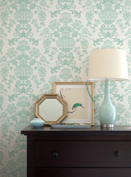
Our new Encantada Damask wall stencil from The Hearst Castle Collection.
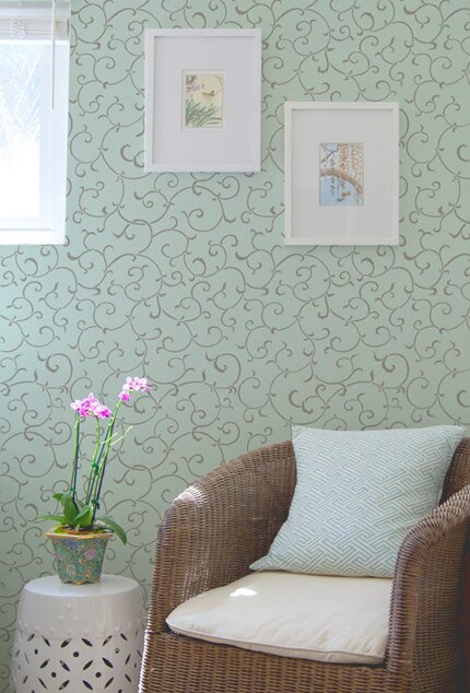
Our delicate Oriental Vine allover wall stencil.
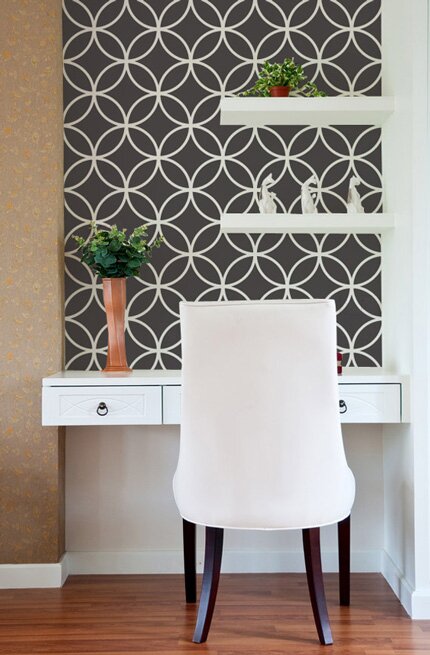
Yes, this one isn’t blue or green, but I had to include it, because the Endless Circle Lattice stencil pattern is shown in the door grillwork above, and the black and white add a certain “punch” to the page, don’t you think?
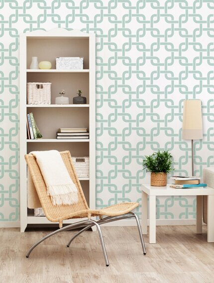
Back to blue, the Linked In modern wall stencil looks very fresh on a white wall….
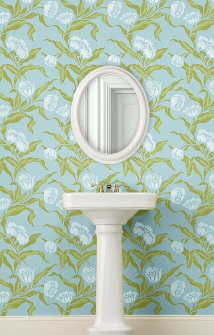
…and the Large Phoebe’s Tulip Vine stencil (also from The Hearst Castle Collection) is perhaps the freshest Spring look of all! Authentic sea glass is becoming more and more rare, but you can certainly bring the soft colors into your home or decorative painting project with the right shades of paint!
January 24th, 2011
Colorscope
What do your favorite colors say about you?
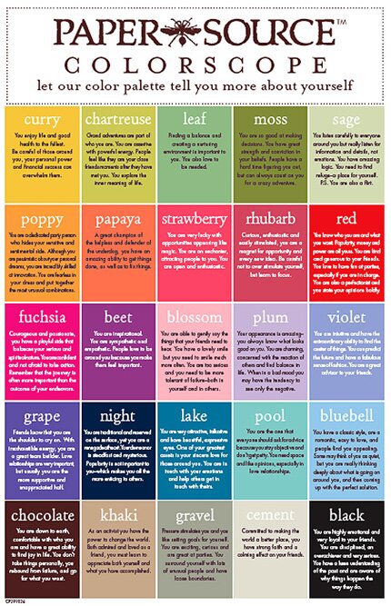
Me? My ”go to” colors are black and shades of blue (bluebell, pool, and night). Do your favorite colors reflect YOUR personality?
Click here to access a large, readable version from the Paper Source blog.
January 6th, 2011
Things Organized Neatly
Reorganizing your studio or creative space for 2011? Serious OCD?!?!? Things Organized Neatly is a nifty tumblr blog with a lot of super cool photos of…..things organized neatly!!
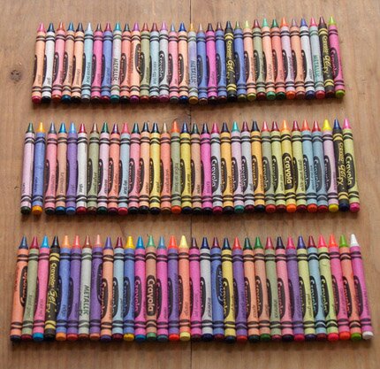
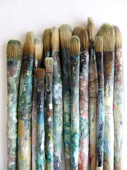
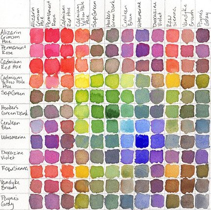

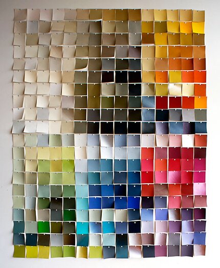
Hint: Click on “Archive” to view all the past photos.
December 9th, 2010
Yolo Colorhouse
I can’t keep from going back to the webstie of Yolo Colorhouse lately. I love their paint colors, their vibe, the design of their website-as well as their environmental approach to paint.
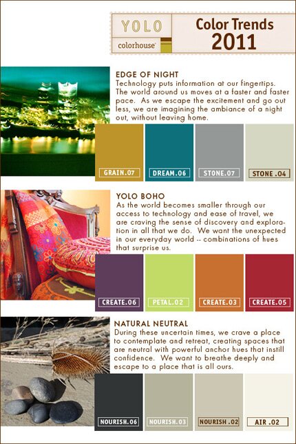
I always appreciate seeing new color trends, and am particularly attracted to Yolo Boho above.

And I love their section on “people in their spaces“. How often do you see interior shots with actual beings in them? It makes it so much more personal, I think.
They also have a super inspirational blog that shows their paint colors matched up to beautiful photography of things like— The Color of Figs. How yummy is that?!
December 1st, 2010
A Pretty Pair
Perhaps you are in a dark and gloomy place, or WORSE, a dark and gloomy “space”. Here’s a double dose of ”happy” from two very colorful ladies….
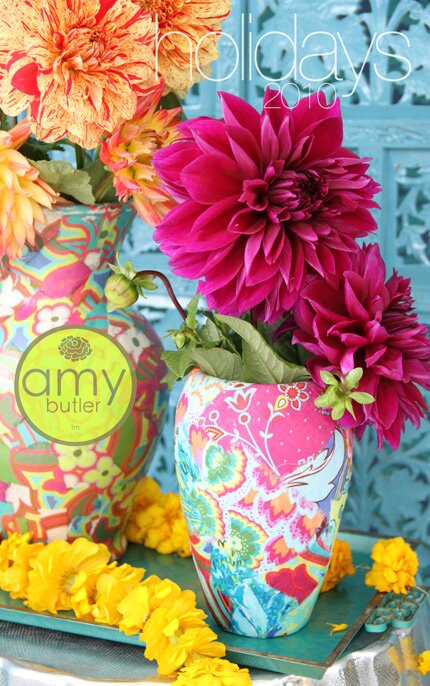
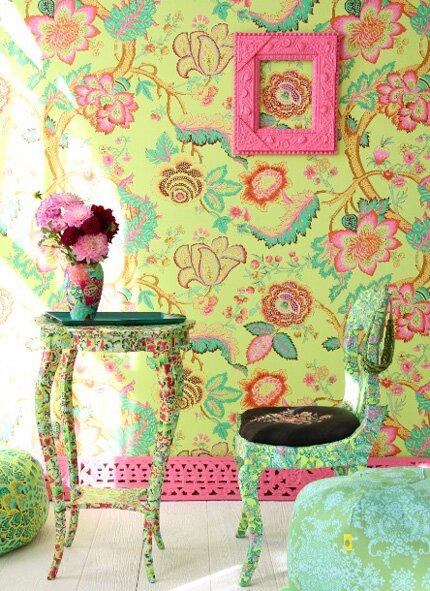
Amy Butler-whose little design empire seems to be deservedly growing by leaps and bounds.
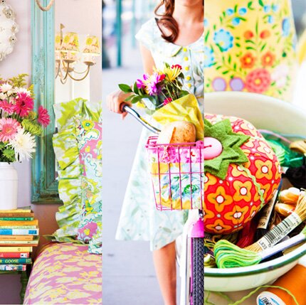
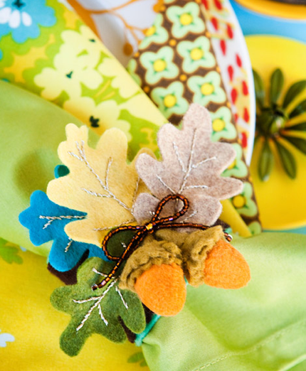
Heather Bailey-a stay-at-home Mom made good.
Enjoy!






 Copyright © Designamour