December 29th, 2006
Cherry Blossom Border
There are four different stencil collections (5 designs each) coming in the Modern Masters line: Ornamental, Global, Botanical and Far East. This was one of my favorite designs/finishes that I plan to work into my home office “Kimono” walls.
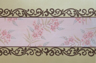
I love combining patterns in a finish and thought these two came together really well. The center band is Shimmerstone that has been stria’d and backfilled, with the Cherry Blossom border design dropped in randomly. I found the Shimmerstone to be a really nice surface to stencil on, particularly with the Metallic Paint Collection colors, which were used straight out of the bottle.

I love the way that you can almost effortlessly create shading and subtle color variations with a dry-brush stencil technique!
December 28th, 2006
Modern Masters Project
One of my reasons for starting a blog is that I thought it would be fun to track my ongoing projects online. Great idea in theory! I am just wrapping up a project that was so intense and time consuming that I didn’t really have time to blog about it-or much else for that matter!
Due to the nature of my business-selling designs and new ideas for decorative painters-it naturally follows that I have always featured and thus promoted the products that I use for my techniques. BIG bonus for them. When Modern Masters recently approached me about hiring me to produce a line of stencils and series of finishes that incorporates their decorative finishing product line, of course I said yes. Designing finishes is what I do. Getting paid?? Great concept!
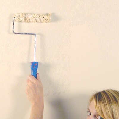
So, 20 new stencil designs and 36 photographed step-by-step finishes later (yes, 36!) I now have the time and energy to write about it. Each finish was done on a large piece of styrene in my studio. With my trusty tripod and camera set to 10 seconds I was able to get hundreds of photographs of me in unflattering positions holding a brush, a roller, a trowel, cheesecloth, etc. Fortunately, we are cropping me OUT of all photos!
I did develop a fondness for the sponge roller, shown above, as we were able to get some really pretty paint finishes by layering and softening colors. This one was just Metallic Pearl over an off-white paint in a couple of layers that creates a soft, organic texture with a lot of depth. I have learned to love easy!
December 26th, 2006
Antique Kimonos
I have been collecting inspiration on Kimono art for a few years now, so thought I would share some of my favorites. If you haven’t noticed already, Japanese motifs are suddenly showing up everywhere. I think that they are so classic that they trancend “trends” though, which is why I am planning on turning my home office walls into a “Kimono Collage”.
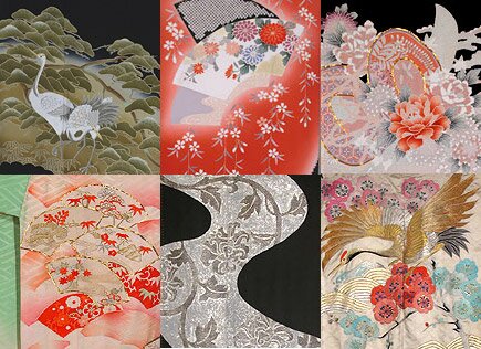
Some of the best color inspiration and design combinations I’ve found are though a website that sells antique textiles www.marlamallett.com. Some of my favorite pieces are shown above. There is so much beautiful imagery (Japanese, Chinese, Indonesian, African, Ottoman, Indian, etc) on this site you may get lost for awhile. Even better, if you have a budget it is all for sale.
December 18th, 2006
Street Art
This link came from Karen on Muralsplus. It is a feature on Juxtapoz, an underground “Arts and Culture Magazine” online. Blek Le Rat is considered to be the originator of stencil graffiti as an art form.
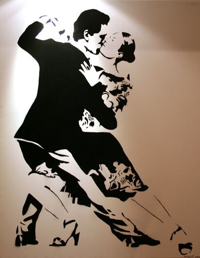
Just slightly different than what we commonly think of as stenciled art, but stenciled graffiti is worldwide and is used to deliver political commentary to the masses and seen by some as “urban beautification”. If you want to delve into it more, there area many links that lead to many more links on my favorite site ever, Wikipedia.
December 12th, 2006
New favorite thing!
At least until the next favorite thing comes along, which will probably be tomorrow. This is a tile design that we just did this past weekend in the 3-day SkimStone class. It was a great class with a diverse mix of people. In case you don’t know, SkimStone is an integrally colored concrete resurfacer (or a resurfacer for any other hard surface when you utilize their Bonding Primer).
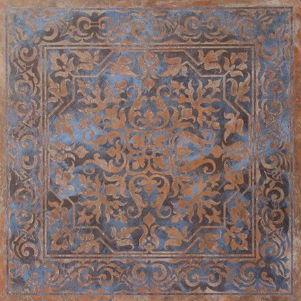
This design, creatively named OrnTile 136 is one of our more recently released designs from Modello Designs and it seemed perfect for one of our class projects to cover a 4′ x 4′ square. At least 8 different people had their hands in completing this, but you wouldn’t know it!

This detail shows the texture that was achieved by using small Japan Scrapers to trowel on quick, random, successive layers of three colors that were then back-filled with a tight trowel of grey. I love the way it plays against the blue background. I would love to see this design/colorway done in a coffered ceiling between heavy distressed beams (possibly stenciled). Unfortunately coffered ceiling are in short supply in my world. Maybe someone out there??
December 9th, 2006
Art under foot
I love designing patterns and finished for floors. Ceilings too! Floors and ceiling are generally an area where you can make a much bigger design statement than walls, with GRAND designs and more combinations of pattern and color. Walls get curtains and photos and pictures and tall furniture, etc. placed in front of them and sometimes need to take a back seat.
Floors and ceilings are definitely more physically challenging to paint and decorate, which is why I said I love DESIGNING for them! LOL. Our current office/studio has a lot of decorative floor treatments that I will miss looking at when we move. I think my favorite though is the Kimono floor that was created a couple of years ago. (I’ve had this Kimono obsession going for awhile, I guess)

The application was a combination of acid and Modello Dye Stains on a Colormaker overlayment. I first graphed out the area and then penciled in the swirls and shapes. This was then translated into a vector file in Adobe Illustrator so the colors could be played with and blocked in and the various patterns moved in and out and around to see what looked good. I love computers-most days! To do the saw cuts that separate the different sections, I had the Illustrator line drawing paper plotted on large sheets of paper that were taped together on the floor and then cut through with a 4″ diamond blade affixed to a grinder. It was a little intimidating at first, but not really that hard. Then the different areas were treated to different color and pattern applications. I think it’s a great look for a commercial space! There are more photos of floors and floor designs in the Floor Show gallery. I should have a lot of fun designing the floor spaces for the new building: Elaborate carpets, large graphics, etc. I am even thinking about the possibilities of painted cork!
December 5th, 2006
My new home

Beautiful isn’t it?! This may be one of the most scary and exciting things that’s ever happened to me. After starting my business in my garage 13 years ago and then being a model tenant to a less than accomodating landlord for 12 years I am going to be the proud owner of my very own commercial building. Well, technically it’s half a building-the front half that is closest. That will be my corner office on the second floor overlooking….well, the view is not that great but I don’t have time to gaze out the window anyway!
We are meeting with the architect in the morning to finalize the interior plans to get bids (gulp!) So many decisions, SO MANY NEW SURFACES! I can’t wait to have my very own fresh new place to decorate. I will have LOTS and LOTS of things to share and show once we really get to planning the fun stuff so please keep checking back.
December 3rd, 2006
Designing Designamour
An “amour” is a love affair, which I find highly appropriate for my relationship with design as I am basically obsessed with looking at it, thinking about it and somehow attempting to create it most of my waking hours.
So, for my personal blog I wanted to design something that looked, well, personal! My most recent creative muse has been kimono art and I have been really inspired by the Japanese design aesthetic in many different ways. I also wanted to design a blog that didn’t look like a typical blog and again WordPress provides that option. Plus, something really cool it that there is a “theme switcher” option with WordPress, so you can actually have multiple themes that reader and viewers can select from and the whole blog changes like that! Adding additional themes for this blog are 146 on my list of things to do, so it won’t be happening any time too soon, but someday…..
While web researching, I came across a really pretty site that I found both unique and inspiring, Jeux de Maux. It’s French, naturally!
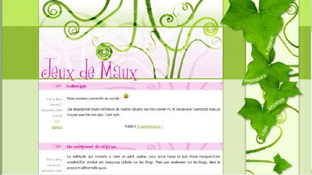
A few clicks later and there are more beautiful blog sites to see here Dotclear. You have to scroll down the page and on the right hand side there is a Themes drop-down menu. Just select different themes to create a completely different way to view the blog. Very cool! Here is just one view.
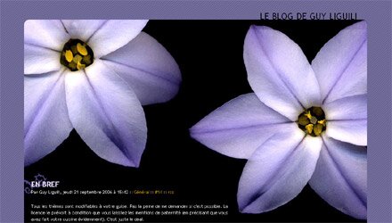
Anyway, just wanted to share that. Like all self-doubting artists, I think that this site could definitely use a few more tweaks but finally figured that I just needed to get it going and will get back to it when I am down to 146 on the list.
December 1st, 2006
Designing a Blog-Art of Living
I found it a little overwhelming when I started looking at blogging options. While is seems that the majority of blogs are on Blogger or Typepad I decided that I really liked WordPress. You can set up your own domain, there is a lot of flexibility in the design and, most importantly, I loved the fact that it has been created, not by a corporation, but by an online community of people who are passionate about their “art”.
To make it harder on myself, I wanted to set up not one blog site, but two; one for myself and one for the Art of Living project I have begun in partnership with Barb Skivington of Faux Works Studio. For days, I researched what the heck a blog was and browsed through dozens of sites and the available theme pages. There are hundreds that have already been designed by programmers all over the world. You can REALLY get lost in this stuff-I was lost quite a few times!!

I kept going back, though, to really clean looking themes by headsetoptions, finally settled on “Easy White” for the Art of Living blog and started working with my in-house graphic artist Lauren on the header and footer. I REALLY like the way it turned out, with the use of color along with B/W photography. Everytime I go to the site it makes me feel good!


 Copyright © Designamour